right topo image left topo image

our graphic design

things we like / diversions: nashville’s hatch show print shop

The wood type poster style has seen a resurgence over the past few years, informing a lot of what’s popular and trendy today. But most of what we’re seeing today is done digitally; designed on computers, and produced on either offset presses or digital printers.

So it’s nice to see some of the original production method still being used (and popular), like at Nashville’s Hatch Show Print shop, which is preserving the typographic, design, and printing method that’s such a endemic part of North American communication history.

No Comments. Categorized as diversions, graphic design, things we like.


Audible Made Visual

April 13, 2013

things we like: camerata de lausanne visual identity

camerata-lausanne-logotype

Designing for musicians or musical organizations is tricky business at the best of times, and especially so for classical ensembles. How do you represent the value of something so intangible, emotionally rich, and historically charged in visual form? (more…)

No Comments. Categorized as graphic design, identity, things we like.


AIS Reboots Its Identity

November 7, 2012

new work: aviation intertec services identity + website redesign

Aviation Intertec Services (AIS) is a provider of aircraft maintenance software and client solutions to medium-sized carriers and fleet service companies all around the world, such as Porter Airlines. For the past decade, their focus has been on developing their flagship software suite, RAAS (Remote Aviation Access System). But now they’re turning toward their marketplace in earnest. (more…)

No Comments. Categorized as graphic design, identity, new work, website design.


The Colour of Theory

December 22, 2010

new work: “cultures of militarization” cover design

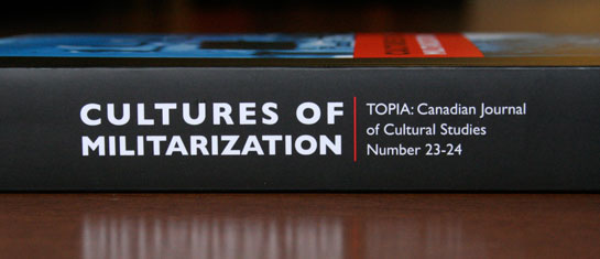
York University’s TOPIA: Canadian Journal of Cultural Studies is just that: a scholarly journal in cultural and Canadian studies, providing a venue for current research in cultural studies for scholars who share a concern with cultures, nationalities, technologies, environments, identities and the politics of space and time. Issue #23-24, Cultures of Militarization, is the latest in over 10 years of publication. eleven-seventeen has been providing cover design for TOPIA for many years, though this special double-issue presented a number of new opportunities worth mentioning. (more…)

No Comments. Categorized as graphic design, new work.


new work: Save a Heart Ball

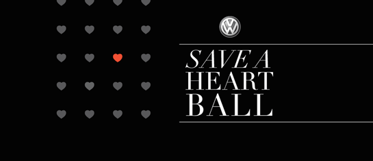
Save a Heart Ball

Not too long ago, every single patient in Thunder Bay and region who needed angioplasty had to go to another centre to receive treatment, such as Winnipeg or Toronto. Given that Thunder Bay is geographically isolated, travelling so far to receive treatment was inconvenient, expensive, stressful for everyone involved, potentially risky, and made recovery problematic.

In response to this crisis, the Thunder Bay Regional Health Sciences Foundation created the Northern Cardiac Fund to expand local cardiac care services. In 2005, the Save a Heart Campaign was conceived to assist in the fund-raising and awareness-raising effort, culminating in a gala event every November, the Save a Heart Ball. (more…)

No Comments. Categorized as graphic design, new work, website design.


things we like: nordkyn

Nordkyn logo

An idle mandate of eleven-seventeen is thinking about, identifying, and cataloging a visual ‘grammar’ of our region; the various shapes, colors, themes, and other visual details that are characteristic of Thunder Bay and the surrounding region. So, naturally, we look to other ‘northern’ areas to see how they’re expressing their identities. The new Nordkyn tourism identity by Oslo’s Neue (for the most northern point of mainland Norway) is a supreme example of how design elements can expressively reflect the character of a place. In the case of Nordkyn, it’s “Where Nature Rules.” (more…)

No Comments. Categorized as graphic design, identity, regional grammar, things we like.


Something NEW

September 3, 2010

new work: Northwest Employment Works

Northwest Employment Works

When the Province of Ontario unveiled its new Employment Ontario training and placement programs, many service providers needed to make some identity changes to better reflect their new mandate. Job Connect, the largest employment service provider in Northwestern Ontario, chose us to help them make this shift with a new identity and collateral, including visual identity standards. (more…)

No Comments. Categorized as graphic design, identity, new work.