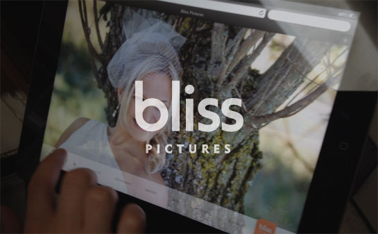
new work / web design: bliss pictures website redesign

Most photography websites created in the past decade have been driven by Flash, and for good reason: Flash provides an excellent framework for very rich multimedia experiences, allowing for a seamless blend of audio, animation, and engaging interactivity. Photography portfolio websites really shine in this medium, and a whole marketplace sprung up just to sell Flash portfolio templates to photographers.
Then on April 3, 2010, the iPad arrived.
Since its arrival, the iPad hasn’t supported Flash. The real reasons for this are myriad, but Steve Jobs was insistent upon it and Steve (almost) always got his way. This meant any content that required Flash – ads, video… photography portfolio sites – was not viewable on iPads.
At first, it didn’t change much. Developing online experiences with iPad users in mind was considered an ‘edge case’. But the iPad phenomenon very quickly evolved from being a curiosity to a full-on game changer, the internet scrambled to adapt to this new, Flash-less reality. Now, not even three years after the first tablet hit the shelves, nearly 50% of North Americans access the Internet on a regular basis using a mobile device that does not support Flash; providing rich content to (certain) tablet and smartphone users is no longer an edge case scenario.
Bliss Pictures, being the savvy creatures they are, realized that they needed to embrace this new reality while freeing themselves from the limits and ‘template-y’ nature of the typical Flash portfolio site. We proposed a full-screen gallery site that didn’t rely on Flash, but rather on HTML5, CSS3, and JavaScript, and which could adapt to the user’s browser, including the newest Retina Macbook or iPad.

With the indispensable assistance of Bryan Davis (who created a custom dynamic image resizing plugin), we designed a WordPress-driven site that provides Bliss with the creative control they require while providing users with a sophisticated and engaging online expression of what Bliss can offer: heart-wrenching visual awesomeness.

For touch users, the gallery is gesture aware; swipe left or right to move through the galleries.
We’d love to hear what you think, and we’re happy to answer any questions you might have. This was a really fun project, and we are so pleased that Bliss provided us with the opportunity to do something a little different.
Visit the website at http://www.blisspictures.ca
One caveat: the Bliss site is optimized for modern, standards-compliant browsers, more or less anything after Internet Explorer 8. If you do experience issues viewing the site, we’d love to hear about it. Our ongoing goal is to allow all visitors to see what Bliss has to offer, even if the experience isn’t as ‘rich’ as it is in current browsers.


Excellent information on how tech is affecting website design, not to mention how to help clients adapt to new trends. Cutting edge.