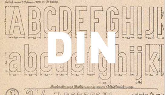
thinking / type notes: din

If you live in Thunder Bay, or have seen tourism advertisements for the city, then you have seen this typeface. You probably see it several times a day anyway because it’s a very popular typeface, but the reason we’re bringing to your attention as the first of our ‘type notes’ series is because it’s currently the typeface used by the Corporation of the City of Thunder Bay in any of its visual communications. It is called DIN.
long ago, in a germany far, far away…
DIN has a long and interesting history. Its origins go back to the “IV 44” type sheet defined by the Royal Prussian Rail Administration (the Königlich Preußische Eisenbahn-Verwaltung, or KPEV) in 1905 for use on its trains, schematics, and blueprints. However, it was quickly expanded for use on all sorts of lettering, including names of railway stations on platforms. In this way it became associated with the KPEV as a kind of corporate typeface1 and in full public view. Following the foundation of the Weimar Republic and unification of the patchwork of German states, the merger of all state railways in 1920 ensured the widespread use of the KPEV typeface across Germany.

A poster from 1927 designed by Constructivist artist Walter Dexel, using lettering based on KPEV/DIN.
Popularity of the typeface grew beyond this original context because it (unintentionally) embodied many of the ideological principles in play in Europe at the time – Realism and Modernism in particular – which attempted to scrape away as much of the cultural references and adornments in as many things as possible, and reduce them down to a purely functional, utilitarian form. This included everything from objects like buildings, furniture, books, art, and music (and, of course, typefaces), to philosophy, science, mathematics, and politics. As a result, several versions of the KPEV typeface began appearing for distribution and use outside of the railway system. The first was released by the D Stempel AG foundry in 1923, with another version by Berthold following in 1929.2
What artists and designers were responding to in the KPEV typeface was its ability to be a neutral and objective bearer of information, free of the social and cultural baggage carried by other typefaces. For instance, most books were printed with only a handful of serif3 typefaces, and so eventually those typefaces became associated with elitism and social inequality. The KPEV typeface, however, had no serifs at all (making is a sans serif typeface) which was somewhat rare at the time, but becoming more common by the early 20th century. It did not vary in its stroke widths, and had no other flourishes or details. It was pure, direct, matter-of-fact, and unbiased, and therefore could be ‘read’ by everyone. Even more – to the glee of Modernist and Constructivist designers – KPEV’s letter-forms were based on a grid, rather than being derived from human hand-stroke letter-forms. It was a typeface for the machine age, a typeface for the people… a typeface for a new Germany.
a typeface for a new germany…
Indeed, from as early as 1917 the German Standards Committee (Deutsches Institut für Normung, or DIN) was working on a universal lettering to be used across the country, both to reflect the uniformity of the new republic, but also to ensure a standard of quality and efficiency. The first standards document concerning letter-forms, DIN 16, was issued in 1919, outlining lettering standards for technical applications. Like the KPEV typeface, DIN 6 was based on a grid and therefore had a consistent stroke width in order to ensure that it could be replicated by any number of tools, from a technician’s pen and engraving tools to compasses and rulers. DIN 17 was released later as a standard for lettering with drawing pens, following the same principles.4

A DIN 1451 correction sheet from 1931, showing both EngSchrift (condensed) and MittelSchrift (standard) widths.
Development of the DIN 1451 standard began around 1924, drawing directly from the lettering system established by the KPEV. With the first release in 1936, this document set the standard for essentially all public lettering across Germany, from road and traffic signs to house numbers and license plates, establishing it as the “Autobahn” typeface. DIN standards practically achieved legal status in September 1939, the very month Germany invaded Poland and sparked World War II. As such, use of DIN 1451 was subsequently dictated by an administrative order, and it was “introduced” into most occupied countries.5
Even from the 1930’s, DIN 1451 had been used on all German military objects – on its planes and tanks, even bomb shelters – but the DIN institute carefully kept itself out of political affairs. Perhaps because of this, DIN 1451 never appeared in Nazi propaganda and never was connected to the Nazi Party. Instead, Futura was usually used for this unfortunate chore.6
Perhaps also because of DIN’s political aloofness, the 1451 standard continued to be used and revised after the war, even into the 1990’s. It remains today as Germany’s ‘official’ typeface.
…but not a typeface for designers. not until 1995.

Current example of DIN 1451 being used on a German road sign (in both EngSchrift and MittelSchrift).
The principles of a grid-based uniform stroke give DIN lettering an important distinction in the world of typography. DIN lettering was not so much ‘designed’ as it was ‘formulated’ for technical purposes, completely outside of the tradition of typography up until that point. In fact, its insistence on a consistent stroke was contradictory to the typographic tradition, wherein it was assumed that varying stroke widths can enable optimal word-images and therefore wasn’t taken seriously by typographers. And since the designers and artists who championed the KPEV typeface and other grid-based lettering had been shut down by the Nazis in the early 1930’s, DIN 1451 was rarely used beyond its intended role.7
However, in the late 1980’s designers (again) started using DIN 1451 in magazines and posters, taking something as banal as state lettering and flipping into a new artistic context. German type designer Erik Spiekermann noticed this trend with curiosity for, like his predecessors, he had always considered the typeface ‘unuseable’ for graphic design purposes. Spiekermann suggested to his colleague Albert-Jan Pool that he should make something useful out of DIN 1451.8
The result was a family of five weights (and real italics) released by the FontFont foundry in 1995, called FF DIN. The differences are minor when viewed up close, but significant to the typeface on the whole: slightly narrower horizontals, and slightly more fluid curves. Finally, 90 years after its inception, it had been ‘designed’ – and therefore became ‘useable’.

Subtle edits, huge effects. (image via Encore Magazine.)
FF DIN doesn’t deviate too much from DIN 1451 though. While subtle structural differences make it more useable, the overall character remains. Pool himself says that FF DIN “‘tells the truth’, that it is a serious neutral typeface.”
Other variants have been released since, including the enormous DIN Next family by Linotype’s Akira Kobayashi, and the PF Din family by Parachute. But when most people generally refer to DIN as a typeface, they are referring to FF DIN.
sudden popularity
DIN is being used all over the world in a wide variety of contexts, not least of which is in our own City of Thunder Bay identity. It is celebrated for being clean, modern, bold, and striking – it looks contemporary, and just feels strong. You might say it is simply straight-forward and (as Pool puts it above) it “tells the truth.” Its impersonal and neutral character allows it to merely be there like a typographic backbone, letting everything else in the design and layout do the talking.
However, Pool wonders if DIN “is something that works in Germany, but it wouldn’t work the same way for example in Britain, because they use a more decorative style.”9 Some observers say that its “impersonal” and “neutral” character gives very little information about the character of its subject; after all, it was designed (or ‘formulated’, rather) for efficiency, uniformity, and the blunt transmission of information.
It doesn’t take much digging to find a version of DIN being used in contemporary graphic design. Here are some recent applications you’ve likely come across:

Clockwise from top-left: New York City Ballet identity; 'MyTbay', a citizen newsletter published by the City of Thunder Bay; JetBlue identity; opening credits for the "Dexter" TV show; "Portal" video game franchise identity; Thunder Bay Transit identity (as an extension of the City of Thunder Bay).
(P.S. DIN 1451 still gets used outside Germany in design roles, and free digital versions are available for personal use since it is an ‘official roadsign typeface’. Some designers actually prefer it over the more recent interpretations for the same reasons the Bauhaus/Constructivist designers liked it, but the general consensus is that FF DIN carries the torch.)
What do you think?
Does DIN suit Thunder Bay as a city? What does it say about us? Does it matter that’s it’s a deeply ‘German’ typeface, or does it work quite well here?
We’re curious to know what you think.
more about din
Here are some additional online resources about DIN and its history:
- 5-part feature in Encore Magazine, by Albert-Jan Pool: 1 , 2 , 3 , 4 , 5
- FontFont’s FF DIN mini-site
- Wikipedia entry on DIN 1451
- Wikipedia entry on DIN lettering in general
- idsgn blog’s mini-feature on DIN
- Typophile’s TypoWiki on FF DIN
- possibly the first of its kind: “Industrial Archeology – DIN, the first German Corporate Typeface?” ↩
- http://en.wikipedia.org/wiki/DIN_%28typeface%29 ↩
- the little ‘feet’ or ‘tags’ at the end of strokes on some typefaces. See the Wikipedia article for more detail: http://en.wikipedia.org/wiki/Serif. ↩
- http://www.magwerk.com/mag.php?magazine=encore&language=en&issue=15&page=76 ↩
- Ibid. ↩
- Ibid. ↩
- Ibid ↩
- http://dinfont.com/story/ ↩
- Ibid. ↩


DIN is far too noisy for my poor ears. lol
Are you making commentary on city council, Paul? 😉
Hello! Just wanted to say “Many Thanks!” for this article. I’m working on a project concerning this typeface and I’ve been pulling together information from a variety of sources. Your article has been a big help! Cheers!