things we like / diversions: elections and typography
We were pleasantly surprised by the Elections Ontario graphics for the the 2011 Provincial Election; a classic, high-contrast palette of black, white, and yellow (except for the neon orange on the Notices of Registration… certainly gets, and keeps, your attention), cute illustrations, and all type set in Gotham Rounded.
Yes, Gotham, the George Clooney of typefaces. Predictable, familiar, and so very, very handsome… friends with Obama. But it’s really popular and gets used everywhere, and so is getting a little tiresome.
But so very, very handsome.
The rounded version was commissioned by Print Magazine in 2007 and was made commercially available shortly afterwards, but it’s like George Clooney in ‘Burn After Reading‘ – cute, but still Gotham:
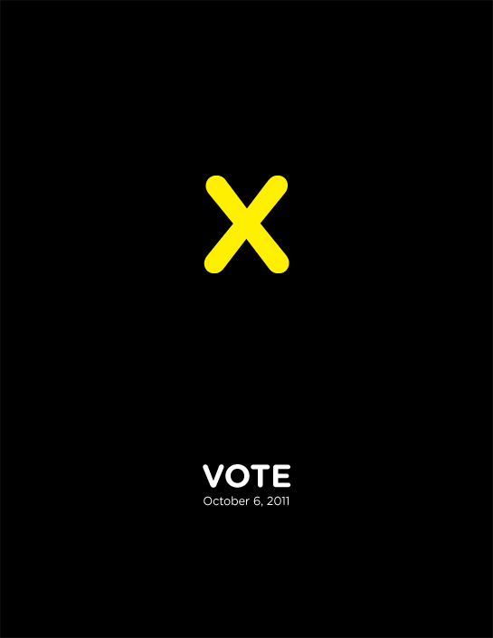
Gotham Rounded. A rounded geometric sans-serif designed in 2007 by Tobias Frere-Jones.
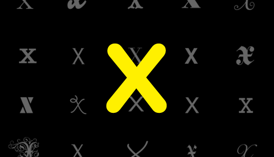
In honor of both the upcoming election and typography (and for kicks), we decided to play with the ‘X’. Here are a few, in alphabetical order:
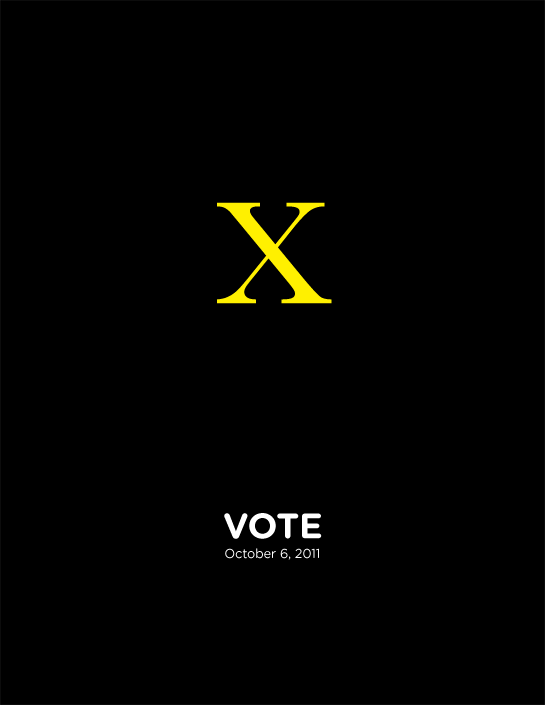
Baskerville. A ‘transitional’ serif typeface designed by John Baskerville in 1757.
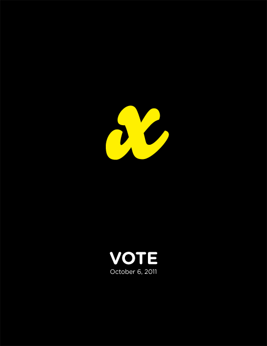
Bello. A fun brush typeface designed by Bas Jacobs, Akiem Helmling, and Sami Kortemäki in 2004. This is the lowercase ‘x’ because it looks more like an ‘x’ than the uppercase version.
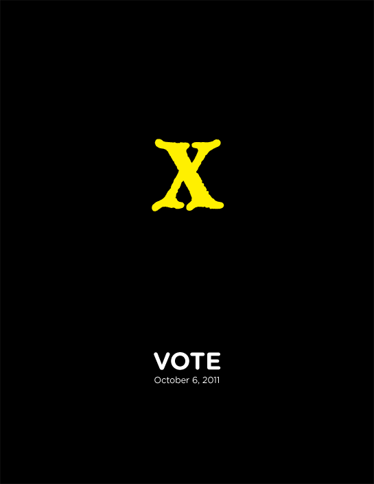
Blackmoor. A pseudo-blackletter designed by David Quay in 1983.

Bodoni “Poster.” There are many of interpretations of this neo-classical serif, all drawing from the original family designed by Giambattista Bodoni in 1798. This version, designed by Chancey Griffith in 1929, has fun, exceptionally hypermodulated strokes.

Bodoni Seventy-Two “Swash.” Based on one of Bodoni’s many script typefaces, this one published by Linotype in 1994.
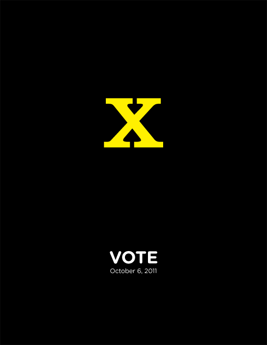
Clarendon. An English slab-serif designed by Robert Besley in 1845. Named for the Clarendon Press, whom commissioned it.

Copperplate Gothic. A unique typeface designed by Frederic Goudy in 1901. While identified as a ‘gothic’ (or sans-serif), it has little serifs that give it a certain finality.
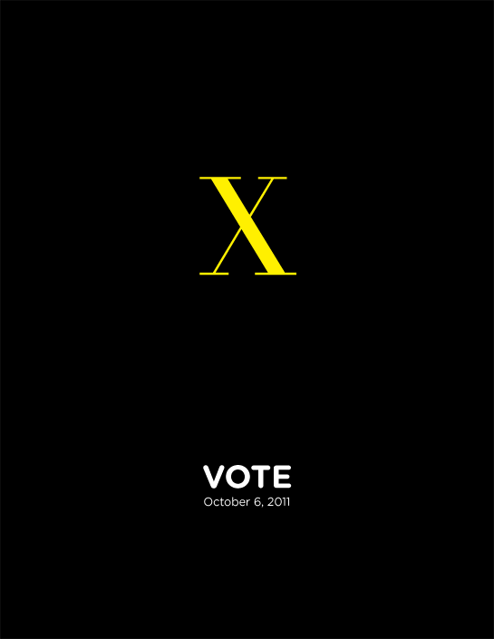
Didot. A family of neo-classical serif typefaces similar to Bodoni, based on the original cut by Firmin Didot around 1800. This version is an interpretation designed by Adrian Frutiger in 1991.

Fetta Fraktur. A German blackletter designed by Johann Christian Bauer in 1850. Fun fact: it was forbidden by the Nazis.

Futura “Black.” Futura is a geometric sans-serif family designed by Paul Renner in 1929. This stencil version, added in 1929, looks nothing like the rest of the family.
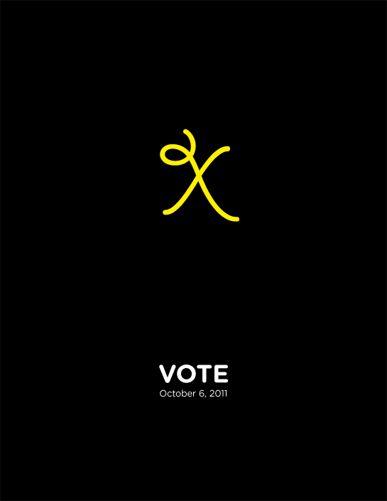
Giddy Up. A fun decorative font designed by Laurie Szujewska in 1993. “It’s election time! Yee-haw!”

Gill Sans. The definitive English humanist sans-serif, designed by Eric Gill in 1926. A little ‘shout out’ to our British parliamentary roots.

Helvetica. Possibly the most popular and ubiquitous typeface in the world. Has its own documentary. A neo-grotesque sans-serif designed by Max Miedinger with Eduard Hoffmann in 1957.
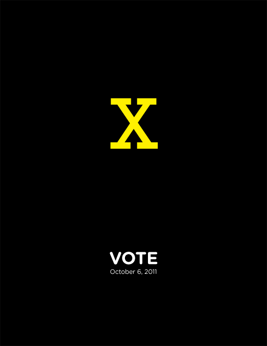
Rockwell. A slab-serif designed generally by the Monotype foundry and released in 1934.

Rothenburg. A (highly) decorative typeface designed by Dieter Steffmann in 2000.
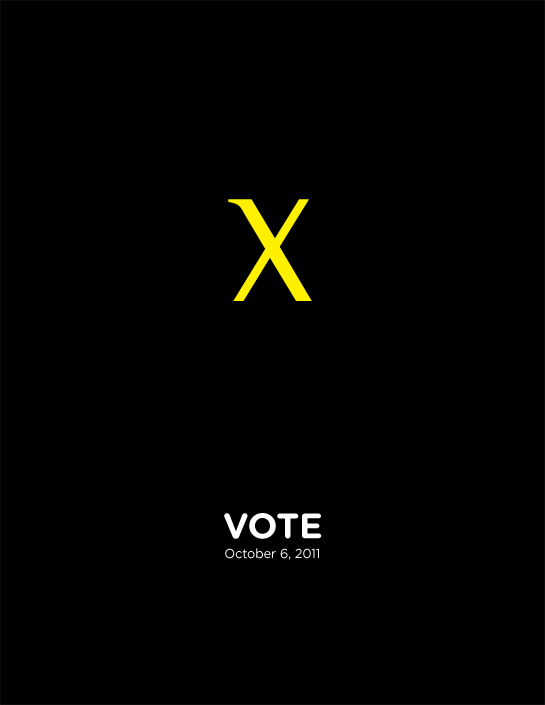
Rotis Semi-serif. A unique semi-serif belonging to the larger Rotis typeface family, designed by Otl Aicher in 1988.
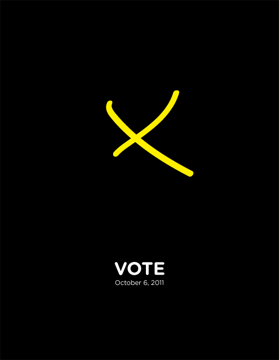
Satisfaction. A script font designed by Andrew Leman in 2003, apparently inspired by the hand-lettering in cigarette ads from the 1930’s. I just like its asymmetrical, ‘in-the-act-of-falling-down’ character.
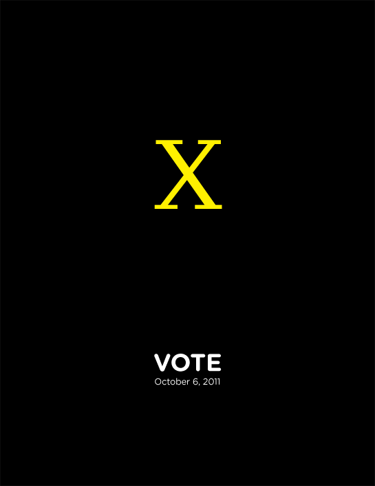
Scala. A humanist serif designed by Martin Majoor in 1990. It seems to combine many different historical influences into one typeface.
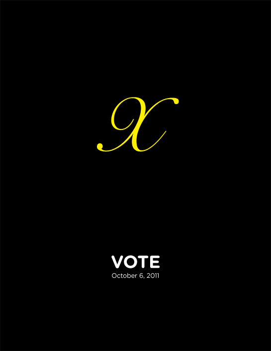
Snell. A script font designed by Matthew Carter in 1965, based on the lettering of English handwriting master Charles Snell.
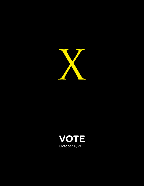
Trajan. An ‘inscriptional’ serif typeface designed by Carol Twombly in 1989. Based on the letterforms found at the base of Trajan’s Column in Rome, dating back to 113 CE. Sadly overused on sappy book and movie titles.
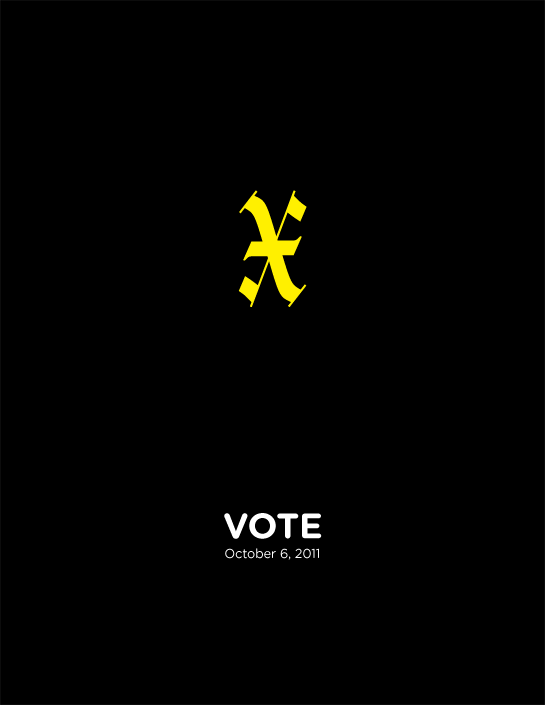
Wilhelm Klingspor Gotisch. A blackletter desinged by Rudolph Koch in 1926, himself being a calligrapher.
Now don’t get us wrong; we really like the Ontario Elections graphics and wouldn’t change a thing about them, and obviously none of these are being suggested as alternatives. That would be ridiculous. We just wanted to have some fun, showcase some type, and promote the election a little.
Besides, it was in interesting lesson: it turns out most x’s are boring and ugly. Yup, it’s true. We have an extensive typeface library, and it was surprising just how similar x’s are from face to face. You have to look at the extremes (some of which you see above) to get something interesting and beautiful, but still recognizable.
I guess there just aren’t that many ways to mark an ‘x’. Be sure to mark yours on October 6!
Posters anyone?


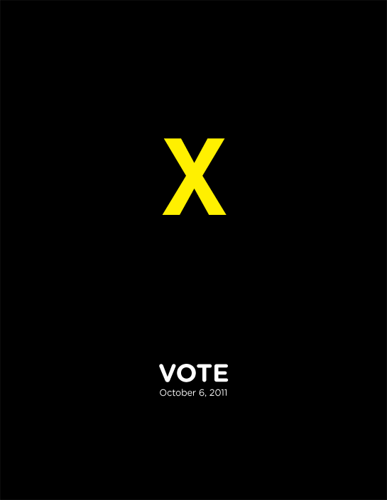
I agree! It is impressive!
Who designed it?
Hey Sophie – we don’t know! You’d think the internets would be more forthcoming, but sadly they are NOT! 🙁
What does that X stand for? Not voting?
Gary – Ha! You thinking it’s an attempt to subliminally discourage people from voting?